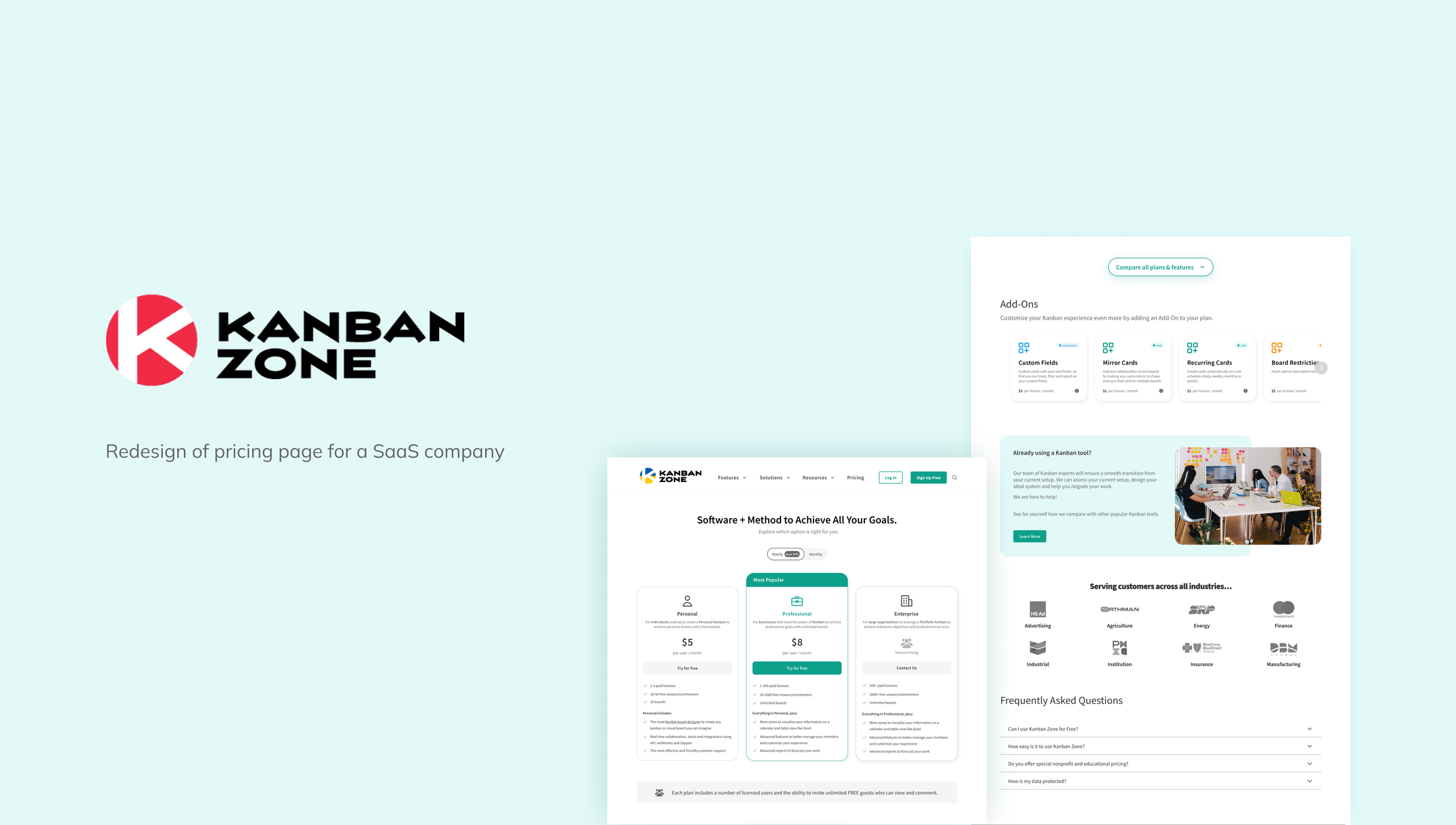
Overview
Kanban Zone is an online Kanban platform that provides Agile/Lean project management solutions for individuals, teams, and organizations. I worked with three other UX/UI Designers to redesign a mobile-first pricing page for Kanban Zone’s website within a 6-week timeframe.
Scope
Pricing Page Redesign
My Role
UX/UI Designer– User Research, Design, Testing
Team
Caitlin Creech
Matthew Kubota
Shaowen Yao
Timeline
Jun - Jul 2022
Problem
Having an outdated pricing page design for more than 5 years, Kanban Zone wants to revamp its pricing page to improve conversion and match its style identity.
The add-ons are what differentiates Kanban Zone from other Kanban tool competitors, but they are hidden within the plan details which makes the users hard to notice. The company wants to make sure users will read and understand the value of the add-ons.
*Shown above is Kanban Zone’s current website (Dated July 2022).
User Goal
Able to compare the 3 subscription plans efficiently and find the one that is most suitable to the users’ needs
Business Goal
Increase average engagement time by 50% and improve conversion by incentivizing the users to take actions on the pricing page, such as starting a free trial or contacting support
Research
Secondary Research
Before diving into the competitive analysis of the company, I wanted to understand more about the UX behind a pricing page. Even though it is just a page on a company website, pricing is a key element of a business’s revenue and the pricing page must be able to communicate the business’s value. Many SaaS companies design their pricing strategy around their subscription plans, so it should be clear how these plans differ from one another to help their customers choose the best option.
I recalled learning about communication and persuasion techniques as a psychology undergrad, which can be applied to marketing and business strategies. Thus, I did some research on this topic and the psychology behind pricing.
Here are 3 key findings from my research on the pricing page:
Competitive Analysis
Having these psychological principles in mind, our team conducted a competitive analysis on other Kanban software, workplace management tools and other SaaS companies based on the following criteria for both desktop and mobile versions:
Pricing (e.g., monthly vs. yearly, add-ons), Visual Organization, CTA Positioning, Content Structure
The competitors we analyzed include Kanbanize, Leankit, Kanban Flow, Kanban Tool, Swift Kanban, Trello, Airtable, Monday, ClickUp, and Asana. I also suggested evaluating other companies that have clear pricing models as references, such as Apple, Dropbox and Notion.
Our team presented research analysis to the client and proposed the following design recommendations based on the psychological principles used and common patterns observed:
Ideation
HMW Statements
How might we help users differentiate the three pricing plans effectively?
How might we increase the noticeability of add-ons and let users understand their value?
Mid-fi Wireframes
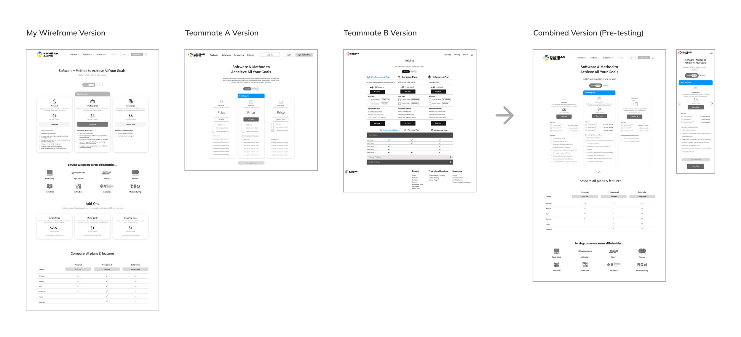
With the HMW statements in mind and the design recommendations we proposed to the client, my design team and I each designed 2-3 versions of wireframes for both desktop and mobile. Upon discussion, we voted on the areas that we liked the most and combined them into one desktop and mobile version.
On top of the changes we made from the design recommendations, we also incorporated the add-ons into the plan cards above plan highlights to increase visibility and clarity.
*The add-ons are designed as a checkbox so when users click on a specific add-on checkbox, new prices will reflect on that current plan.
Testing
Key Learnings
To evaluate our designs, we conducted two rounds of 1:1 moderated usability testings with 5 users each– the first round with our mid-fi wireframes and the second round with our hi-fi prototype. To tackle the HMW statements, the questions focus on exploring users’ ability to differentiate between the plans and understand the add-ons:
How would you go about reading the page? How would you compare the plans?
If you wanted to see all features in a plan, what would you do?
What do you think about the add-ons section?
Here are our main discoveries from the tests and corresponding iterations we have made from the user feedback:
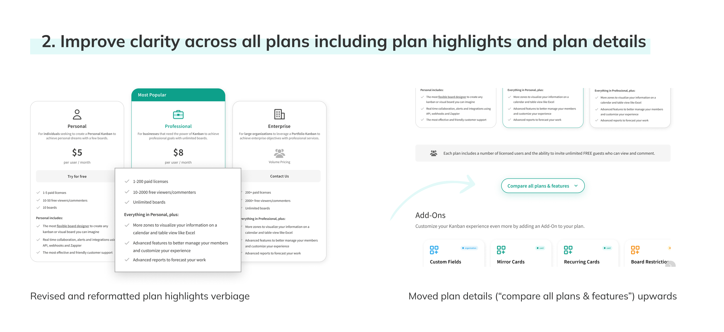
Originally, the plan highlights that were written by our team raised some concerns in the first round of testing because they were not clear and convincing enough for users to pick a plan and purchase.
In the second round of testing, users also had a harder time learning more about each plan because the “plan details” section was below the “add-ons” section in the revised version.
Hence, our client assisted with the plan highlights copy after we shared and discussed our findings. Moving the “plan details” section upwards, right after the plan cards, also enhances users’ workflow, which users can easily check the plan details after viewing the plans at a glance. With clearer copy and user flow, this iteration reduces buyers’ friction and helps potential customers pick the right plan and purchase.
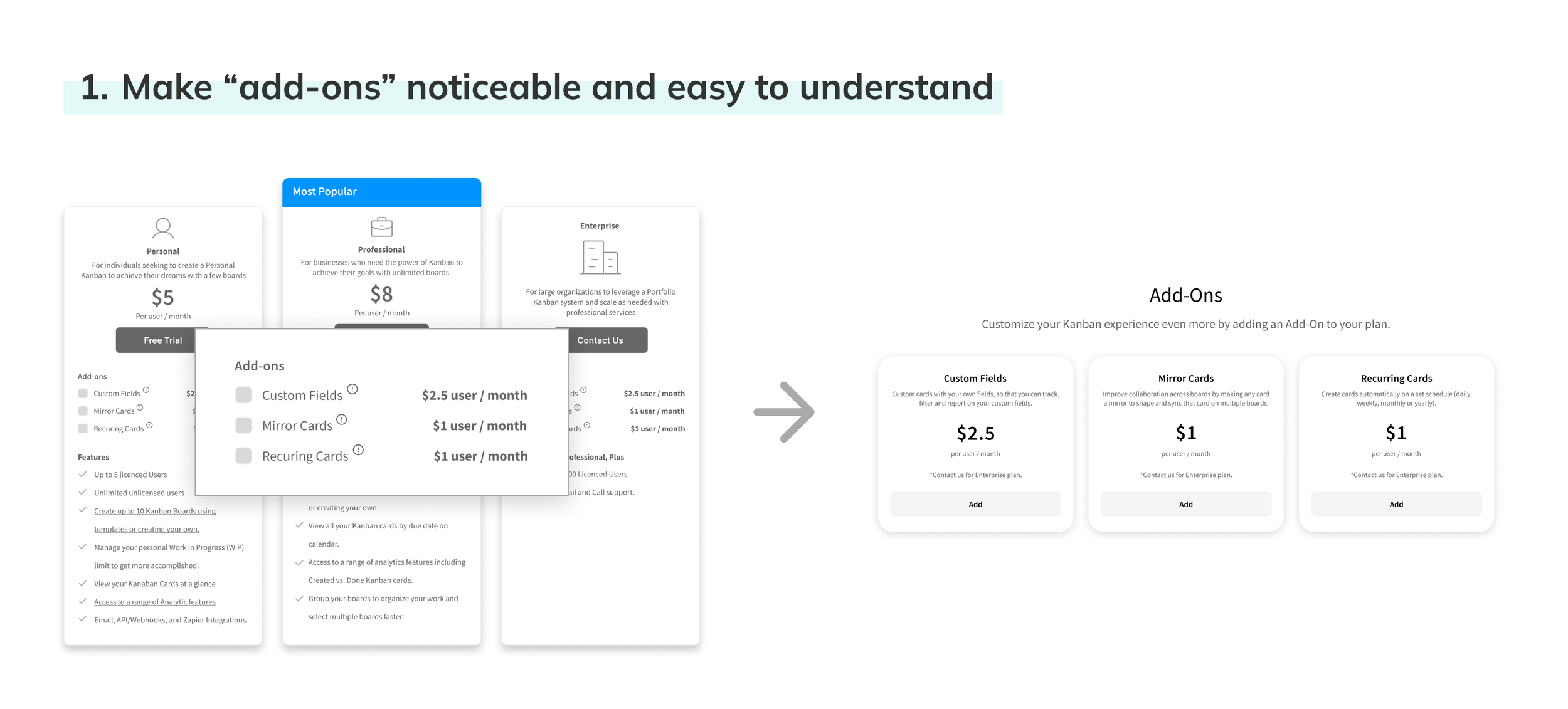
Originally, our team decided to include the add-ons in the plan cards instead of plan details (Kanban Zone’s current website) because it allows users to notice the add-ons at a glance without scrolling. The intention of designing the checkboxes with the add-ons was to let users see the updated plan prices easily.
However, based on our feedback, the new placement of add-ons created confusion. Users expressed that they were still trying to learn about the plans. Reading the add-ons before understanding each plan’s selling points and seeing the additional costs upfront hinder them from taking further actions. Moreover, the users mentioned that it was troublesome to click through the same add-on repeatedly to see the updated price for all plans.
Hence, I suggested the team incorporate the add-on design I initially ideated from my wireframes. I noticed the pricing for the add-ons was the same across the three plans on Kanban Zone’s website, yet they were listed repeatedly under the plans. Thus, instead of listing the add-ons repeatedly one by one under each plan, I designed the add-ons in a separate section as cards. After my explanation, the team agreed that this is a feasible approach.
Having the add-ons in a separate section matches the users’ journey. Users can learn about what each plan entails first and then read the add-ons. This can incentivize their purchasing decisions instead of creating more confusion.
Design

Final Prototype
Reflection
Overall, this project was a very valuable experience to collaborate with three other UX designers from around the world and directly engage with the client and their design team.
Takeaways
Managing expectations with clear and concise communication
Given that our client and team members all work at different timezone and it was a fully remote project, it was very important to set clear deadlines and priorities in a limited timeframe. Since our client could only meet us once every Monday, we made sure to schedule scrum meetings twice a week– before and after our client calls. I actively communicated with the team about the list of specific tasks by the order that need to be done to ensure that we reach our weekly goal.
I constantly shared my progress and the reasons behind my work to discuss with my team throughout this project. In the beginning, I would propose ideas and directions to the team and make sure everyone is onboard and happy before I move on. However, one of our team members got sick halfway and another one wasn’t as responsive, so I learned that sometimes I need to either make the decision first or be more assertive (e.g., “If I don’t hear back from a certain time, I will proceed with x).
While it is important that everyone is heard, it is not efficient to wait for everyone’s opinions on every little task especially when there are people who don’t engage much with the project. If my team members didn’t have any feedback by x time after I shared my idea, I would proceed first and ask for feedback afterwards. With this experience, I learned to manage expectations better and be more strict when needed.
Defending your design decisions
Throughout the project, the client sometimes has opinions that are different from our design. Even though it is important to understand what the client needs and wants, it is also crucial to determine which opinion to take and which to not. I actively defended our design decisions in situations where our client’s idea is not helpful to the user’s goal and experience. I learned to stand firm in design decisions that contribute to the user and business goals while ensuring that our client’s concerns are resolved.
Next Steps
Validate metrics through website analytics
I would validate our design by checking the user engagement and conversion rate before and after the design goes live. This can be achieved by setting up events and heat maps that show conversion rate metrics in Google Analytics.
More user research and interviews
Due to time constraints, our team only had one week to do user research. I would spend more time on user research and conduct user interviews to gain a more in-depth understanding of the target audience and better improve the design and content.


